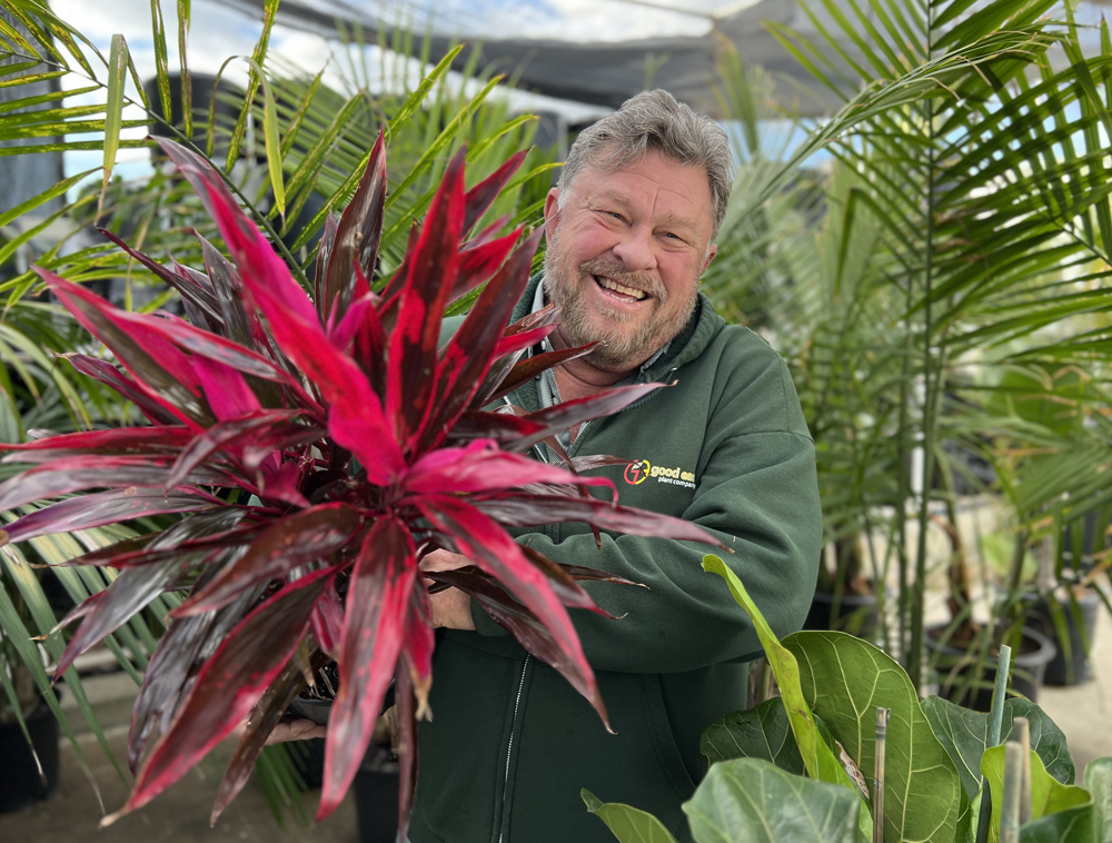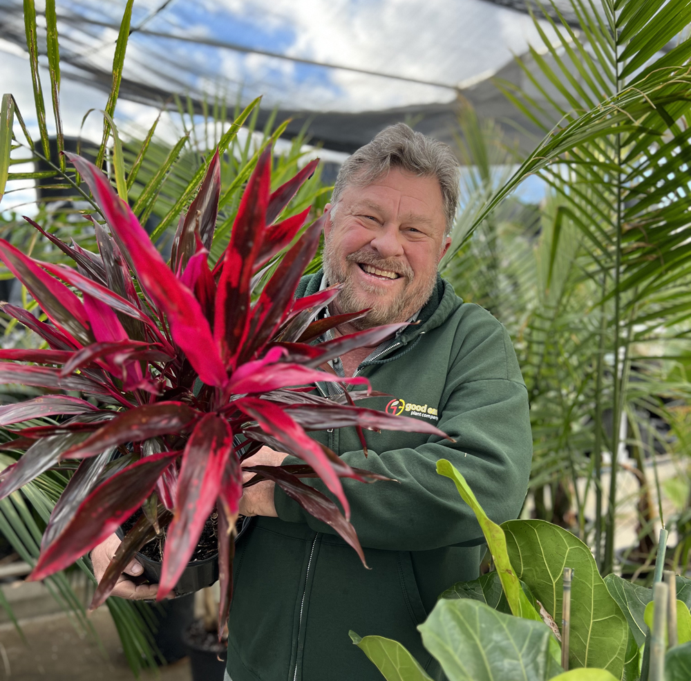
Cordyline fruticosa is a popular tropical indoor plant you can add to your home to show off the 2023 Pantone Color of the Year – Viva Magenta. NOTE: These plants are toxic to pets – keep them out of reach. Photo: Erin Lindley, Good Earth Plant Company
Good Earth Plant Company first started writing about the Pantone Color of the Year in 2017. Design trends matter to our clients, but it was mainly something fun to do. The big surprise: how much it matters to you, too!
After a few years of peaceful, soothing colors to get us through the pandemic, Pantone is ready for a party. The 2023 choice is a bold deep pink, “Viva Magenta.”
Magenta is equal parts cool and warm, a pink with a hint of purple. It’s a color Pantone’s executives say represents an optimistic future. Pantone Vice President Laurie Pressman is quoted saying Viva Magenta represents a prevailing desire for optimism, resilience, outside-the-box thinking and technological innovation to create a better world.
Putting Viva Magenta To Work Enriching Peoples’ Lives

Phalaenopsis Orchids are the type we use most often in our displays at Good Earth Plant Company. They come in several colors – including Viva Magenta. Photo: Pixabay
We look forward to the annual announcement every December. Can you recall the Colors of the Year back to the start in 2000? Hint: The most popular color groups in order: Blue (7), Yellow (4), Pink (3) and Red (3). The answers are at the end of the blog.
Good Earth Plant Company keeps current with design trends including color so our projects fit current tastes and times. Our clients expect us to be up to date, and their clients expect the same. It’s a way for businesses to demonstrate are keeping up with current practices. What impression would you get from a hotel if its lobby looks like it was straight out of the 1970s, or a restaurant stuck in the 1990s?

The bold color of Viva Magenta fits beautifully into a clean or neutral high tech interior design scheme. Photo: Good Earth Plant Company
Good design helps create a connection with customers. Forward-thinking businesses need to stay current with design trends to create the best possible experience for their customers. This is the reason so many companies are incorporating the principles of biophilic design into their buildings, and why they’re keeping us busy at Good Earth Plant Company by adding workplace greenery, living walls, and other natural design elements.
Pantone spends six months researching its next Color of the Year. It looks at trends bubbling up in fashion, cosmetics, home décor, paints, and even architecture and toy design. Pressman describes it as taking the social temperature and figuring out what people are drawn to.
The Power of Color in Biophilic Design

Since I began my career as a florist, color has always been important in my world. Nature was my first color system and it’s still our main color system for the design decisions at Good Earth Plant Company. Photo: Frauke Riether
Since I began my career as a florist, color has always been important in my world. Nature was my first color system and it’s still our main color system for the design decisions at Good Earth Plant Company. This year, Pantone representatives say their experts observed “a heightened appreciation and awareness of nature.” We know why: more people are starting to understand the importance of biophilic design.
People are bringing more plants and other natural materials into their homes. Thanks partly to the pandemic, people are embracing more outdoor activities, experiencing nature in something as simple as a daily walk among trees or by tending to their plants
Horticulture and design trends have always been connected throughout history. When human beings first learned how to take plants and flowers along with minerals and animals to create crude paints and dyes, they learned how to use and manipulate color. The way we approach color today isn’t all that much different. We just use more sophisticated tools.
Nature Knows Best

Plant and flower color is determined by DNA, but human beings often tinker with it to breed new color varieties of popular plants like daylilies and roses. Photo: Ulrike Leone
The bright magenta pink and other eye-popping color in flowers come from a plant’s DNA. All genetics created in nature without human interference are about survival.
Flowers are the reproductive parts of plants. Flower colors and shapes develop to attract pollinators to pick up pollen so they can transfer it to other plants and flowers. This allows the plant to reproduce.
It’s possible Viva Magenta and other colors in this vivid pink and purple spectrum represent the most ancient plant life on Earth. A study by NASA astrobiologists published in 2018 offers a scientific theory that the first plants were a purple color before chlorophyll evolved and caused plants to appear green.
Imagine what our world would look like if plants were purple instead of green! There might be life on other planets who followed the purple path. If you want to learn more and stretch your scientific knowledge, read the article.
Viva Magenta Color Inspiration

Good Earth Plant Company embellished an existing mural with brightly colored moss wall art for a one-of-a-kind creation.
Green dominates our designs because we are working with plants and other natural elements. People love our orchids and bromeliads, and both feature this year’s Color of the Year. There is plenty of creative potential when we match plants to containers. We’re going to have fun working with Viva Magenta! Moss wall materials come in unlimited colors. It’s exciting to think about new options to get our creativity flowing.
We expect to see a dose of Viva Magenta early in 2023 at the Tropical Plants International Expo in Florida.
Good Earth Plant Company stays ahead of color trends to provide our clients with updated plant styling ideas. Color choices instantly communicate a lot about your business and your home. We can all tell when someone hasn’t updated their interior design for several years.
Can you use an update? Can you use more nature in your life? Good Earth Plant Company looks forward to another year of enriching peoples’ lives with plants in 2023. One of those lives could be yours. Contact us – we’d love to get started.
Previous Pantone Colors of the Year
2022: Very Peri
2021: Illuminating and Ultimate Grey
2020: Classic Blue
2019: Living Coral
2018: Ultra Violet
2017: Greenery
2016: Rose Quartz and Serenity
2015: Marsala
2014: Radiant Orchid
2013: Emerald
2012: Tangerine Tango
2011: Honeysuckle
2010: Turquoise
2009: Mimosa
2008: Blue Iris
2007: Chili Pepper
2006: Sand Dollar
2005: Blue Turquoise
2004: Tiger Lily
2003: Aqua Sky
2002: True Red
2001: Fuchsia Rose
2000: Cerulean Blue

